Most people don’t read documents. They skim.
If a page looks cluttered, messy, or like too much effort to read, they ignore it.
Employees skip instructions, misunderstand steps, and waste time asking for help instead of using the resources available.
The problem isn’t always the content.
It’s how it looks.
Bad formatting, poor layout, and heavy text blocks push people away.
Good design pulls them in.
If your documentation isn’t designed for readability, clarity, and engagement, it won’t be used—no matter how important it is.
Here’s how better design can save your content.
Why People Ignore Poorly Designed Documents
Before fixing the problem, it helps to understand why people avoid reading poorly designed content.
1. The Brain Prefers Visuals Over Text
People process visuals 60,000 times faster than text.
Almost 90% of the information sent to the brain is visual.
This is why infographics, diagrams, and charts help people absorb information quickly.
A full page of text?
Most people won’t even try to read it.
2. Skimming Beats Reading
The average person skims instead of reading line by line.
If key details aren’t easy to spot, people miss them or give up.
Documents with clear headings, bullet points, and visual breaks hold attention longer.
3. Clutter = Confusion
Too many words, no spacing, and long paragraphs overwhelm the brain.
If a document looks too complicated, people assume the content is complicated too.
A cluttered layout makes learning harder, which leads to frustration and mistakes.
4. Branding Builds Trust
A well-designed document feels professional and reliable.
If something looks messy, inconsistent, or outdated, people distrust the content inside.
Strong branding creates credibility and improves engagement.
How to Design Documents People Actually Read
Fixing document design isn’t about making things pretty.
It’s about making information clear, engaging, and easy to follow.
1. Use Visual Hierarchy to Guide the Eye
People need to see the most important information first.
Good document design guides the reader’s eyes by using:
✅ Headings and subheadings to break up content
✅ Bold and colour highlights for key points
✅ Icons and symbols to reinforce meaning
When readers can immediately see what matters, they are more likely to pay attention.
2. Break Up Text with Bullet Points and Spacing
No one likes reading a wall of text.
Break up content by:
📌 Using bullet points instead of long paragraphs
📌 Adding whitespace to give the eyes a break
📌 Keeping sentences short and clear
Good spacing makes documents easier to read and scan quickly.
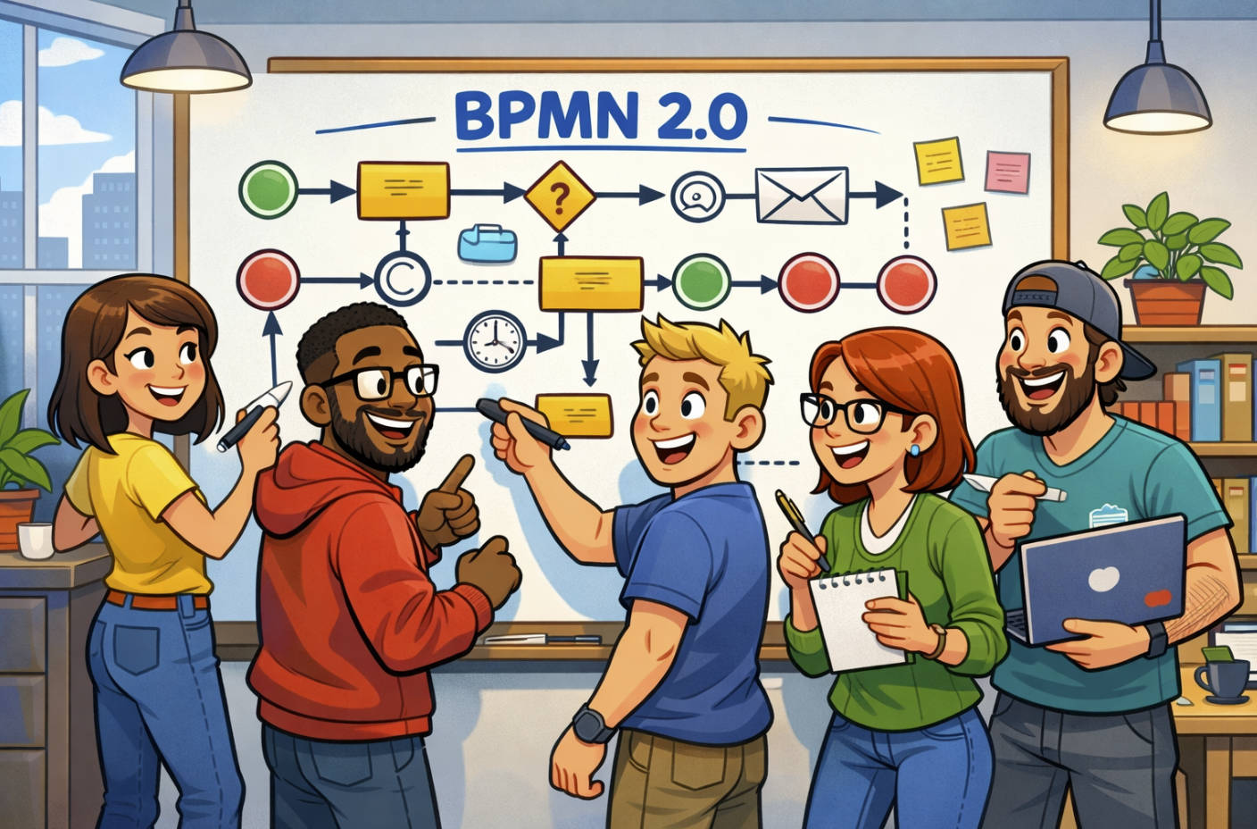
3. Use Infographics and Diagrams to Explain Complex Ideas
Words alone aren’t always enough.
Flowcharts, step-by-step visuals, and infographics help people understand faster.
Diagrams work well for:
📌 Processes and workflows
📌 Decision-making steps
📌 Comparisons and data presentations
People remember visuals better than words, so use them wherever possible.
4. Stick to a Consistent Colour Scheme and Branding
Inconsistent design looks unprofessional.
Stick to a clean, readable font and use brand colours to keep documents visually consistent.
Well-branded documents feel more credible, which increases trust and engagement.
5. Use Icons to Reinforce Meaning
Icons act as visual shortcuts for common instructions or sections.
For example:
📌 Warning signs for risks
✅ Checkmarks for approved steps
🚀 Action symbols for key tasks
Icons make scanning easier and faster.
6. Make Instructions Easy to Follow
Poorly designed instructions cause mistakes.
Good instruction design should include:
📌 Numbered steps for processes
📌 Screenshots or examples for software guides
📌 Bolded keywords for quick reference
If instructions are hard to follow, employees guess or ask someone instead.
How Good Design Saves Time and Money
A well-designed document isn’t just easier to read.
It reduces mistakes, improves efficiency, and saves businesses money.
1. Employees Find Information Faster
If employees can quickly scan and understand a document, they waste less time searching for answers.
This means faster decision-making and fewer delays.
2. Training and Onboarding Are More Effective
New hires learn faster when training materials are clear and engaging.
Better-designed documents reduce onboarding time and improve knowledge retention.
3. Fewer Errors, Less Frustration
Poorly formatted instructions cause mistakes.
Good document design minimises errors by making steps easy to follow.
This reduces rework, frustration, and wasted effort.
Takeaway
Most employees ignore poorly designed documents.
They skim, skip, or struggle because the information isn’t clear or engaging.
Good document design fixes this by making information easier to read, scan, and follow.
A well-designed document isn’t just about looks—it improves efficiency, reduces mistakes, and saves time.
The question is:
Will your documents help people—or will they ignore them?