

There’s a pattern I’ve seen on more than a few platform rollouts.
The business analyst writes the requirements.
The designer picks them up afterwards, then makes them look good.
Development builds it, testing signs it off, the thing goes live.
Six weeks later the support tickets start.
Not because the requirements were wrong exactly.
More that they described what the system should do, without describing what a person would actually experience while doing it.
Those 2 things aren’t the same, though they get treated as one.
🧩 Requirements say what, design says how it feels
A requirement might read something like this.
“The system shall allow the user to submit a claim with supporting documentation.”
That’s a perfectly valid requirement.
It’s also silent on nearly everything that determines whether the rollout works.
- How many screens does that take
- What happens when someone has 14 documents to attach
- Can they save halfway through, then finish tomorrow
- What does the error message say when a file’s too large
- Does the person know what they’re meant to attach in the first place
Design answers all of that.
Analysis defines the boundary, design defines the journey inside it.
Neither one is complete on its own, which is why they work far better in parallel than in sequence.
🔍 Discovery works better with 2 disciplines in the room
The most useful thing I’ve found is bringing a designer into current state work early, not after.
The 2 disciplines notice different things in the same conversation.
An analyst hears a rule.
“Claims over $5,000 need a second approval.”
A designer hears friction.
“So the approver gets an email, then logs into a separate system, then has to find the claim again.”
Both observations came from the same 10 minutes with the same person.
Only 1 of them ends up in a traditional requirements document.
When you sit in those sessions together, a few things improve straight away.
- You spot where a process rule is really a system limitation in disguise
- You catch the workaround people built because the current screen is awkward
- You get a shared understanding, so there’s no handover translation loss later
- You can sketch something rough on the spot, then watch the person’s reaction
That last point is worth a lot.
A rough sketch gets a stronger response than a written requirement ever will.
People struggle to imagine a described system.
They react immediately to a drawing of one.
✏️ Prototypes get you better requirements, not just better screens
This one surprises people.
Prototyping isn’t just a design activity, it’s a requirements gathering technique.
Put a clickable prototype in front of a subject matter expert, then watch what happens.
They’ll stop you within 30 seconds.
“That’s not right, we don’t capture the customer number there, it comes from the CRM.”
You’ve just learned an integration requirement you’d never have got from an interview.
Some of the requirements prototypes tend to surface.
- Data that needs to come from another system
- Fields that are mandatory in practice but optional in policy
- Steps that happen out of order in reality
- Permissions nobody thought to mention
- Volumes that make the designed approach unworkable
Written requirements get reviewed politely.
Prototypes get argued with, which is far more useful.
If you’re an analyst without a designer on the project, low fidelity is still fine.
Boxes on a page, drawn badly, will do the job.
The point isn’t the artefact, it’s the reaction it provokes.
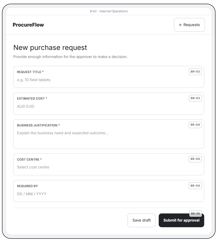
UI/UX Wireframe: A two-screen tablet wireframe showing how business requirements are translated into user flows, interface elements, and interactions.
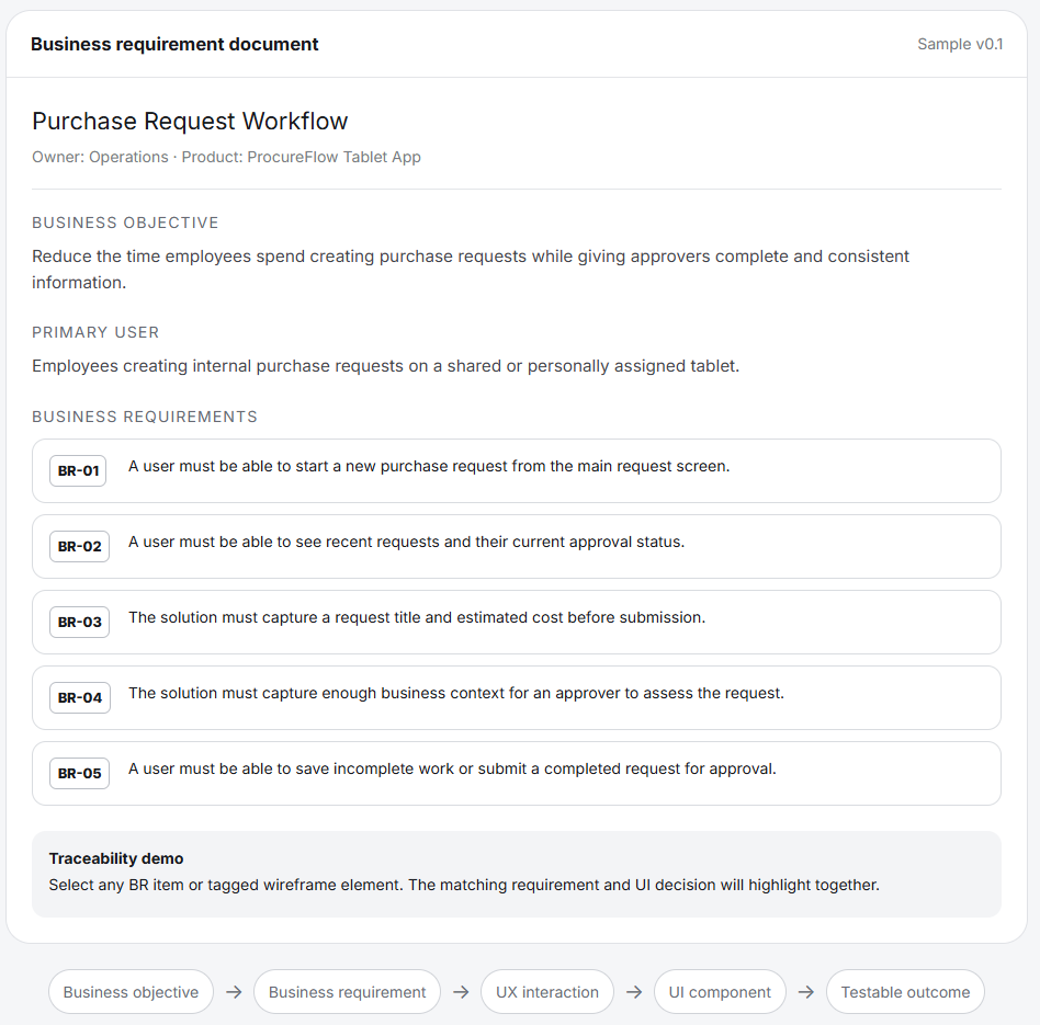
Business Requirements Document: A sample BRD defining the business objectives and functional requirements that guide and validate the corresponding UI/UX design.
👥 Where the 2 skills genuinely strengthen each other
There’s a fair bit of overlap once you look closely.
Analysts bring things designers benefit from.
- The business rules, the edge cases, the regulatory constraints
- Process context, so a screen fits the wider flow
- Data models, so the design doesn’t ask for something that doesn’t exist
- Stakeholder relationships built over months
- Volume, exception, integration knowledge
Designers bring things analysts benefit from.
- Actual user research, rather than assumptions about users
- Information hierarchy, so the important things sit where people look
- Accessibility, which is often a legal requirement nobody wrote down
- Testing methods that find problems before build, not after
- A way of showing stakeholders something concrete early
Put those lists side by side, then it’s obvious the gaps in each are covered by the other.
🖥️ Rollouts fail on adoption, not on function
Here’s the part that matters commercially.
Most platform rollouts I’ve seen didn’t fail because the system couldn’t do the job.
They struggled because people avoided using it properly.
Staff kept the old spreadsheet.
Data quality dropped because a field was confusing, so everyone typed anything to get past it.
Support volume stayed high because the interface didn’t match how the work actually flows.
Every one of those is a design problem showing up as a business problem.
You can meet 100% of your requirements, then still lose the benefits case.
Which means adoption should be treated as a requirement in its own right, with design as the way you deliver it.
🤝 How to run the 2 together in practice
A few things that work without needing a restructure.
Put the designer in discovery sessions.
Same meeting, not a separate round with the same tired stakeholders.
Map the process, then map the experience.
A BPMN map shows the flow across teams.
A journey map shows what the person feels at each step, where they hesitate, where they give up.
Do both, then compare.
The pain points rarely sit where you’d expect.
Write requirements that leave room.
Specify the outcome plus the constraint, rather than the screen layout.
Something like the user needs to complete a claim in under 5 minutes, with the ability to save partway.
That tells a designer what to solve for.
Test with real people, early.
Even 5 users will surface most usability issues.
That’s cheap, quick, far less painful than finding them in UAT.
Share the same backlog.
Design work sitting in a separate tool creates 2 versions of the truth.
📋 What this means for documentation
There’s a knock on effect worth mentioning.
Well designed systems need less documentation.
If the screen makes the next step obvious, you don’t need a 6 page work instruction explaining it.
When I’m writing procedures for a system that was designed properly, the guide gets shorter.
When the design is poor, the documentation gets long, because it’s compensating.
So a good rule of thumb.
If a work instruction is running past 2 pages for a simple task, that’s usually telling you something about the interface, not the writer.
✅ The short version
Analysis defines what the business needs.
Design determines whether people can actually do it.
Run them together from the start, then you get a system that meets the requirements plus one people will use.
Run them in sequence, then you’ll meet the requirements, hit your dates, still wonder 6 months later why nobody’s using it properly.
About the author
Aiver Ilaya is an IT consultant based in Melbourne. For 19 years he’s worked on enterprise digital transformation programs. His experience spans ITSM, HRIS, ERP, CRM, POS, KMS and EDRMS platforms, plus workflow automation. He has worked across government, healthcare, science and medical research, finance, education, telecommunications, infrastructure, aviation, construction and property, technology, retail, logistics, pharmacy, insurance and professional services.
His work covers business analysis, process optimisation, technical writing, knowledge management and UI / UX design. He has worked on multi-million dollar programs running years at a time, for national organisations and global firms, reaching millions of end users.
He has run his own consultancy for 12 years and works with a small number of clients at a time. Available for remote and hybrid contracts.
alisodigital.com